
SawtoothTrade
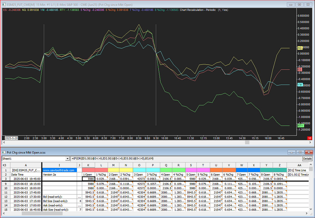
3-session 8-symbol %change since market open
Click on each link above to download.
Put both files in your Sierra Chart \Data folder, then open the chartbook.
Here is a chartbook/spreadsheet study that will plot up to 8 symbols correlated as a percent change from up to 3 Open times per 24 hours so, for example, you can reset the line at the Open of the London, New York, and Asian sessions, all on one chart.
The chart's symbol, set in the Chart Settings, is the first symbol, and is set to Blank.
Up to 7 additional symbols are set in each of the Add Additional Symbol studies, all of which are Hidden. The lines are then all drawn by the spreadsheet study.
If you want fewer lines, set the Draw Style of even numbered subgraphs from Line to Hidden in the spreadsheet study settings. Lines 5-8 are set to Hidden by default.
Three Time Line studies are used to set up to 3 Open times.
If you want fewer Open times, set 2 or 3 to the same time.
The spreadsheet requires no user input, so it could be minimized.
Version 2a: To significantly simplify setup, entire system was reconfigured using a single chart, instead of overlays from other charts, by utilizing multiple Add Additional Symbol studies.